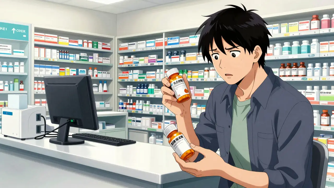
Ever notice how your blood pressure pills have a label that looks completely different from your cholesterol medication, even though you get them from the same pharmacy? Or maybe you switched pharmacies and suddenly the directions on your bottle feel like they're written in a different language. It's frustrating, and it's not just your imagination. The truth is, there is no single nationwide standard for how a prescription labels should look in the United States. While we have strict rules for the medicine inside the bottle, the sticker on the outside is a bit of a Wild West.
This lack of consistency isn't just a design flaw; it's a genuine safety risk. When the layout changes, our brains-which love patterns-can easily skip over a critical warning or misinterpret a dosage change. Understanding why this happens can help you be more vigilant about your own health and know what to ask your pharmacist to ensure you're taking your meds correctly.
The Fragmented World of Pharmacy Rules
You might assume the government dictates exactly what goes on a pill bottle, but the reality is much more complicated. The FDA is the federal agency responsible for protecting public health by ensuring the safety and efficacy of drugs. While the FDA has very strict requirements for the "professional labeling" (the dense packets of paper that come with a drug), their rules for the actual bottle label are surprisingly minimal. In some cases, the federal government only requires the label to say "Rx only."
This leaves a massive gap that is filled by two different forces: state boards of pharmacy and voluntary standards. Because each state manages its own pharmacy laws, you end up with 47 different regulatory frameworks. For example, the Texas State Board of Pharmacy has very specific rules about font sizes-mandating that prescription IDs be no smaller than ten-point Times Roman-while California might focus more on requiring bilingual labels for certain high-risk medications.
Then there is the USP (United States Pharmacopeial Convention), which is a nonprofit organization that sets official standards for medicines, food ingredients, and dietary supplements. In 2012, they released General Chapter <17>, a set of patient-centered guidelines designed to make labels easier to read. They suggest using sans-serif fonts like Arial, 1.5 line spacing, and simple language (like "for high blood pressure" instead of "for hypertension"). The catch? These standards are voluntary. A pharmacy can choose to follow them, but they aren't legally forced to unless their specific state board adopts them.
Why Layout Changes Lead to Medication Errors
When a label layout changes, it disrupts your mental shortcut. Most of us don't read every word of our prescription label every single time we take a pill; we recognize the "shape" of the information. If your pharmacy changes its software or switches to a new label vendor, that shape changes. This can lead to a dangerous phenomenon called "label confusion."
Consider a real-world scenario shared in pharmacy communities: a patient who took a double dose of a blood thinner simply because the label format changed between refills. The phrase "take 1 tablet twice daily" was positioned differently on the new label, causing the patient to misread the frequency. Research from the Institute for Safe Medication Practices suggests that medication errors could be slashed by 30-40% if we actually standardized typography, scheduling, and language across all pharmacies.
| Authority | Primary Focus | Legal Weight | Key Goal |
|---|---|---|---|
| FDA | Professional Prescribing Info | Federal Law | Scientific Accuracy |
| State Boards | Administrative Compliance | State Law | Regulatory Oversight |
| USP <17> | Patient Understanding | Voluntary Standard | Patient Safety |
The Tech Gap: Software and Systems
Even if you stay with the same pharmacy chain, your bottle might look different if the store updates its Pharmacy Management System. There are about a dozen major software systems used nationwide, and each handles data printing differently. Pharmacy technicians have reported that a huge percentage of patients return to the counter for clarification not because the dose changed, but because the formatting did.
The cost of fixing this is a major barrier. Updating a system to meet new standards isn't as simple as clicking a button; it involves redesigning labels and retraining staff. Estimates suggest it can cost a single pharmacy location anywhere from $2,500 to $7,000 to fully implement a new standardized labeling system. For a small independent pharmacy, that's a significant hit to the bottom line.
Accessibility and the "Invisible" Patient
Standardization isn't just about where the pharmacy's phone number sits; it's about making sure everyone can actually read the instructions. Many patients struggle with visual impairments or limited English proficiency, yet the industry has been slow to provide alternatives. According to a 2022 audit by the American Pharmacists Association, only 38% of pharmacies consistently offer large print options, and a measly 5% offer audible formats.
The Access Board provides clear guidelines on how to handle this. They suggest that if a pharmacist notices a patient struggling to read, they should offer a private counseling session and a label in an accessible format (like Braille or extra-large text). However, because these are guidelines and not mandates, the level of care you receive depends largely on which pharmacy you walk into.
Where We're Heading: Digital and Standardized Futures
The good news is that the tide is turning. The Biden administration's 2022 Patient Safety Action Plan aims to get 90% of states to adopt standardized labeling by 2026. We're also seeing big corporate moves; for instance, CVS Health committed to implementing USP <17> standards across all 10,000+ of its locations. Their pilot programs showed a 33% drop in patient inquiries when labels were made clearer.
Beyond the physical bottle, the Medication Adherence Technology market is booming. We're seeing an increase in smart packaging and mobile apps that scan a variable physical label and translate it into a consistent digital display on your phone. This removes the human error associated with varying fonts and layouts, providing a reliable "single source of truth" for the patient.

How to Protect Yourself from Label Confusion
Until every bottle in the country looks the same, the responsibility for safety often falls on the patient. You don't need to be a pharmacy expert to protect yourself, but you should adopt a few simple habits:
- The "Double Check" Ritual: Every time you get a refill, compare the new label to your old one. Don't just look at the drug name; check if the instructions (e.g., "twice daily") have moved or changed wording.
- Ask for "Plain Language": If a label says something like "Take q.i.d.", ask the pharmacist to print it as "Take four times a day." The USP recommends this, and most pharmacists are happy to do it.
- Request Accessibility: If you find yourself squinting at the bottle, ask for a large-print label. You have a right to a label you can actually read.
- Use a Digital Log: Keep a list of your medications and dosages in a phone app or a notebook. This gives you a baseline to compare against whenever the pharmacy changes its layout.
Why does my pharmacy change the label layout occasionally?
Label changes usually happen due to software updates in the Pharmacy Management System, a switch to a new label printing vendor, or changes in state regulatory requirements. Even within the same chain, different stores may be on different update cycles.
Is there a legal standard for prescription labels in the US?
There is no single federal standard for the visual layout. The FDA provides general requirements, while the USP provides voluntary patient-centered guidelines. The actual legal requirements are set by individual state boards of pharmacy, leading to 47 different sets of rules.
What is USP <17> and why does it matter?
USP <17> is a set of evidence-based standards created by the United States Pharmacopeial Convention to improve patient safety. It recommends using clear fonts, high contrast, and simple language to reduce the risk of medication errors caused by confusing layouts.
Can I ask my pharmacist for a larger font?
Yes. Most pharmacies can provide large-print labels, and some can even provide Braille or audio-accessible formats. If your pharmacy says they can't do it, you may want to look for one that follows the Access Board's accessibility guidelines.
Does a different label mean my medication has changed?
Not necessarily. A change in layout often has nothing to do with the drug itself. However, because layout changes can lead to misreading dosage instructions, you should always verify the dosage and frequency with your pharmacist whenever the label looks different.
Next Steps for Patients and Caregivers
If you are managing medications for a parent or a spouse, the risks of label confusion are even higher. For caregivers, the best move is to create a "Master Medication List." This list should include the drug name, the exact dose, the time of day it's taken, and the reason for the medicine. When the pharmacy bottle arrives with a weird new layout, don't trust the label blindly-cross-reference it with your master list first. If anything doesn't match, call the pharmacy before administering the dose.